


We’ve all been there – subjected to a presentation with overwhelming amounts of data and an endless barrage of slides, after which we leave the room wondering “What was the takeaway in all that?” Or worse, we’ve been the presenter that needed to cover a lot of important and complex information within limited time constraints, but when we look out at our audience, we see their eyes completely glazed over. According to MIT Sloan faculty, Miro Kazakoff, it doesn’t have to be this way.
In his recent webinar, 4 Foundational Tactics for Better Visual Data Storytelling, Kazakoff shares simple and practical ways to ensure you’re presenting information as clearly and efficiently as possible.
First, Kazakoff warns of the “curse of knowledge” impacting our communication with others. Once we know something, we forget what it was like to not know. This makes it difficult for us to view data from the audience’s point of view. We make assumptions on their knowledge based on our own, impacting how we communicate. The deeper one’s expertise, the worse the curse.
Kazakoff uses the example of the image below. When asked to describe the image, everyone makes a similar observation: a red rose.

However, no one ever mentions the dolphin until it’s pointed out. Once pointed out, it’s impossible to unsee the dolphin – and this is what the “curse of knowledge” is all about.

It’s wonderful to know things, but you need to take a moment to examine that bias and reflect carefully about how you present information to those missing the context cues you already possess.
You can fight the “curse” with these four tactics:
- Identify the main point and write it out as a headline
- Aim for one idea at a time
- Maximize the data to ink ratio
- Visualize all comparisons explicitly
Identify the main point
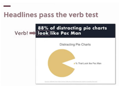
Kazakoff recommends that you use a headline at the top of your slide that explains the point of the data you’re sharing versus simply describing the data. For example, instead of labeling a slide with “revenue last year,” use “revenue is increasing” to instantly highlight the key takeaway of the data you’re presenting.
An easy hack to determine if you have a good headline is to ensure it has a verb – or as Kazakoff calls it “passing the verb test.”
Once you begin implementing headlines at the top of your slides, you can create presentations that pass the “narrative test.” If your audience were to read and retain just the headlines the presentation would make sense, the flow would be clear, and they would be able to agree with and understand the key takeaways.
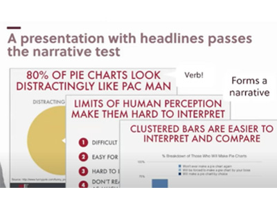
While a tough pill to swallow, you also need to assume that your audience won’t be giving you their undivided attention. The verb in the headline essentially tells the audience “There’s a dolphin in the rose.” You tell them the main point of the slide upfront and they can confirm it with the data below. You want to give your audience clarity and transmit information as efficiently as possible – so even if they only remember the headlines, they have an understanding of how the data impacts them.
One word of caution though - avoid creating headlines that share takeaways beyond the data on the slide. For example, “revenue is declining” and “we need to spend more money on advertising” are both headlines. However, the latter extrapolates beyond the revenue data point. You actually need more data to support that headline and make that logical leap. Clarity and efficiency are key. This brings us to…
Aim for one idea at a time
Audiences can handle more than one idea – but you don’t want to present more than one idea per slide. As the presenter, you may be tempted to create slides that present as much information as possible – after all, you want to demonstrate your hard work and expertise. However, more information doesn’t mean it’s better. Kazakoff states you want to be effective through the clarity of your ideas, not the volume of ideas.
If you have fifty points you need to make, then you need a deck with fifty slides. If you can’t do that due to either time constraints or limitations on number of slides allowed, then you need to focus on editing. And please, do NOT bypass the editing process by thinking “I’ll just put down 5 ideas per slide and talk really fast.” That doesn’t do you or the audience any favors.
Kazakoff uses this slide as an example. Can you count the number of 9s? It will probably take you a while since you’re being presented with many data points vying for your attention.

However, by making two simple changes – highlighting the 9 in a different color and reducing the opacity of all the other numbers – the 9 is now extremely visible. One idea is now clearly presented!

Perhaps you might have originally solved this problem by circling the 9, or adding arrows that point to the 9. All this does is add more visual complexity, when you should be focused on minimizing it. This practice of fading out other data is a great hack to retain complexity without compromising the focus of the slide.
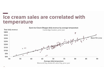
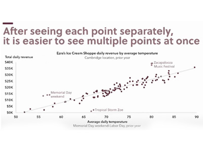
What if you need to make multiple points with the same data? You can do that – you just need to present them one at a time. Kazakoff uses this slide about ice cream sales as an example. What is the point you want to make with the data?
You can correlate ice cream sales with temperature:
You can also increase the focus on the outliers to explain specific events:
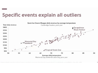
Once your audience has seen each point separately, then they’re able to take in those multiple points at once as part of the narrative.
If you sequence your ideas in order – so that they are clearly connected with one generating the next, forming a story – you create a structure that allows people to easily follow and retain one idea at a time over 10 slides versus getting lost on one slide with those same 10 ideas.
Maximize data to ink ratio
Kazakoff states that you should think of very pixel on the slide as ink and there are two categories.
Data Ink – a mark that conveys information to the audience
Non-data Ink – a mark that doesn’t convey information to the audience. Examples include backgrounds, meaningless icons, excess color, grid lines, shadows (a pet peeve of Kazakoff), 3D effects for 2D information, boxes, etc.
The goal is to optimize data ink to total ink ration. You don’t want to necessarily get rid of ink, rather you want to be deliberate about the ink you do use.
Yes, you want your slides to be aesthetically pleasing and engaging – but if all your audience remembers is how nice your graphs looked, but not the message you were trying to convey with them, you’ve failed. You need to determine what the audience needs to know and focus on how to best present that. Why does this visual matter to them and how will it impact their life?
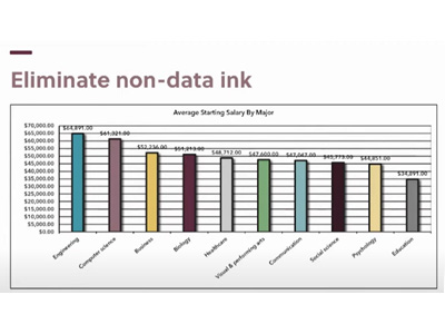
Here is an example of a slide with bad data ink ratio. It’s got it all – multiple colors, grid lines, the dreaded shadow, etc. It’s a lot of information to take in and therefore you’re not sure what to takeaway.
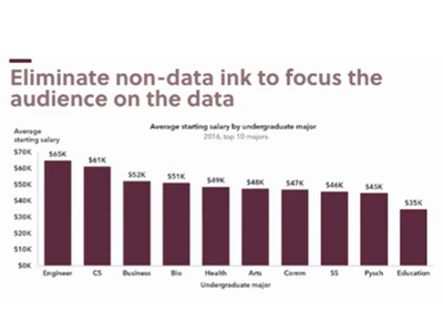
Here is how Kazakoff would revamp that same data using principles of the data ink ratio. Here all the data ink used is deliberate and it’s much clearer to understand the data.
Visualize all comparisons explicitly
Finally, it’s important to help your audience evaluate the data. Is the data being presented good or bad news? Does this data require my attention somehow? You want to ensure the conversation is focused in a cohesive direction.
When applicable, include: goals, targets, averages, thresholds, and tolerances. These are all data points that help an audience quickly and uniformly ascertain the same baseline.
For example, this slide which demonstrates the current sales against the projected sales makes it clearer to understand that the organization is not performing as one had hoped. Without that visual cue, the audience might think “What’s the problem, we seem to be increasing sales over time?”
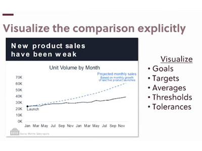
Visualizing comparisons provides that additional important piece of contextual nuance that would otherwise be missed.
What’s next?
These are just four tactics from Kazakoff that you can start implementing immediately with a noticeable positive impact. However, there’s so much more ground to cover. In his course, Persuading with Data, Kazakoff leads participants through structured practice of these skills (and more) on a current presentation they are actually working on. Through detailed feedback from Kazakoff and classmates, participants emerge with an improved ability to persuade others with data through story telling.
Learn more about Persuading with Data.
You may also be interested in Kazakoff’s book, Persuading with Data. (Participants in his course receive a complimentary copy).
Guest post by Elaine Santoyo Goldman